
| Widget | What it does | Modes | Where in the Add menu | Example |
|---|---|---|---|---|
| Color Picker | Edits a colour right on the canvas | All | Next to the Color Swatch | 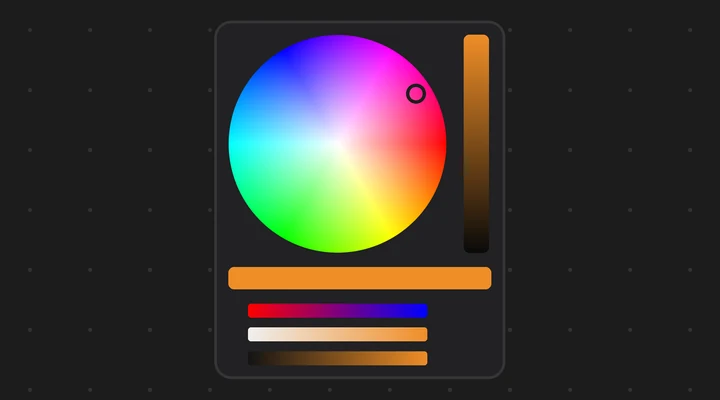 |
| Color Palette | A grid of colour swatches, click one to use it | All | Next to the Color Picker | 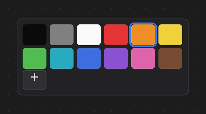 |
| Brush Picker | Makes one brush the active brush | Brush modes | Under Action Buttons |  |
| Ring Menu | Brushes, toggles and operators in two rings | All | Under Action Buttons | 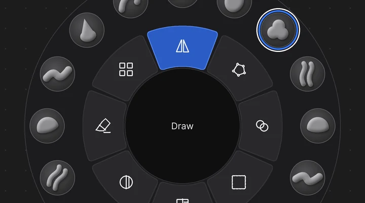 |
Color Picker#
A Color Picker edits a colour right on the canvas. Its Data Path points to a colour property, like the Color Swatch: a light, the world, a material's Base Color or viewport colour.
It shows:
- a hue and saturation wheel with a brightness bar beside it,
- an old / new swatch strip,
- sliders.
In the sidebar, Show picks the parts: Wheel, RGB, HSV and Alpha (alpha only for colours with 4 items). By default the wheel and HSV are on and RGB is off.
Shape#
Shape picks how the colour area looks:
- Wheel: the hue and saturation wheel with the brightness bar. New pickers and old files use it.
- Ring + Square: a hue ring around a square, as in Krita or Photoshop. Drag on the ring to change the hue. Drag in the square to set the saturation (left to right) and the brightness (bottom to top).
Using it#
Drag any part in Live Mode. The colour changes live.
- When you release, the change is one undo step, and it is keyed if Auto Keying is on.
- Press Esc or right-click during a drag to put the colour back.
- The swatch strip shows the colour from the start of the last drag on the left.
Colour spaces and bright colours#
- The wheel and the HSV sliders work in display space, as Blender's own picker does.
- The RGB sliders show the stored values (scene linear for most colours), like Blender's R, G and B fields.
- Bright (HDR) colours above 1 are kept. The V and R, G, B sliders then run from 0 to the value at the start of the drag. The brightness bar stops at 1.
- Negative channels are kept when you edit other values.
Color Palette#
A Color Palette is a grid of colour swatches. Its Data Path points to a colour property, like the Color Picker: the Texture Paint colour, a brush colour, a light or a material colour.
Click a swatch in Live Mode and the property gets that colour.
- The click is one undo step, and it is keyed if Auto Keying is on.
- A colour with alpha keeps its alpha.
Add a Color Palette from the Add menu, next to the Color Picker.
Where the colours come from#
Pick one of two Sources:
- Own Colors: a list kept in the widget. A new palette starts with twelve colours.
- Palette: a Blender palette, the same kind Texture Paint uses. Pick it or make a new one in the sidebar.
The sidebar lists the swatches:
- Change a colour there, move it up or down with the arrows, or remove it with the cross.
- Add Current Color adds the colour the property has now.
Look#
- Columns: how many swatches go in a row. The swatches grow to fill the widget.
- Swatch Size: a largest size for them (0 means fit the widget).
- Swatch Roundness: rounds their corners.
- Show Active: rings the swatch that matches the current colour.
- Add Button: puts a plus button after the swatches. A click on it adds the current colour, like Add Current Color.
Brush Picker#
A Brush Picker is one brush on the canvas. Click it in Live Mode and that brush becomes the active brush, as when you pick it in the tool shelf or the asset shelf. A click is one undo step.
It works in the modes that use brushes:
- Sculpt, Vertex Paint, Weight Paint, Texture Paint and Sculpt Curves,
- the Grease Pencil Draw, Sculpt, Weight and Vertex modes.
Find it in the Add menu under Action Buttons. When the active page is set to another mode, it is greyed out there. The Armature Picker has none, since it always works in Pose Mode.
Choosing the brush#
In the sidebar, Choose Brush searches the brush assets:
- the Essentials that come with Blender,
- the brushes marked as assets in this file,
- your own asset libraries.
The list shows the brushes of the active page's mode, or of the mode Blender is in.
Display#
Display picks what the widget shows: the icon and the name, only the icon, or only the name.
Roundness gives the button its own corners. Turn on the checkbox next to it, then:
- 0 is a square button, 1 is fully round.
- A square widget showing only the icon, at 1, is a round brush button. The brush preview is cut to the same shape.
- Off, the button keeps the theme's corners.
What it tells you#
- The active brush is highlighted.
- In a mode that can't use the brush, the widget is dimmed and shows an amber mark.
- If the brush asset can't be found any more (a library was removed or renamed), the widget says "missing" and a click tells you why instead of failing.
Ring Menu#
A Ring Menu puts brushes, toggles and operators in a ring on the canvas, like a sculpt wheel. It stays on the canvas: it is not a pie menu that opens and closes.
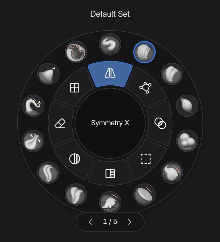 Screenshot
It has three parts:
- The outer ring: round slots. A brush slot shows the brush preview.
- The inner ring: segments, as many as it has items.
- The core in the middle: the name of the item under the mouse, or of the active brush.
In Live Mode:
- Click a brush and it becomes the active brush. The active brush has the accent ring.
- Click a toggle and it switches on or off. A toggle that is on has the accent colour.
- Click an operator and it runs, here or in a 3D Viewport where it can.
- Each click is one undo step.
Items#
Each item has a Type:
| Type | What a click does | What to set |
|---|---|---|
| Brush | Makes the brush active | Choose Brush, or the eyedropper for the brush you use now |
| Toggle | Switches an on / off property | Property: its path, for example tool_settings. |
| Operator | Runs an operator | Operator, for example paint., and its Arguments, for example mode='INVERT'. On When (optional): a property, for example sculpt_object.; while it is on, the item is drawn pressed. Dyntopo uses that one when it is empty |
A toggle or an operator can also have a Disabled When property: while it is on, the item is greyed out and a click does nothing. For example, Voxel Remesh is disabled while Dyntopo is on (sculpt_object., its default when the field is empty).
The editor#
The sidebar follows the ring, top to bottom:
- Page 1 of N: the arrows go to the previous and next page (they wrap around). + adds an empty page after the one shown; the bin removes it, and its brushes (it asks first). Pages only change the outer ring.
- Outer Ring: the brushes of the page shown. + searches the brush assets and adds one. The brushes button fills the outer ring with every Essentials brush of the canvas page's mode, starting at the ring page shown and going on to new ring pages as needed.
- Inner Ring: the actions. They are the same on every page. + opens the presets: symmetry, automasking, mask and face sets, Dyntopo, Voxel Remesh, undo and redo, or a custom toggle or operator.
- The selected item:
- The arrows move it earlier or later in its ring. You can also duplicate or remove it.
- Its settings: what it does (see the table), Use a Preset... for an action, its Label in the core and its Icon (a name from the icon packs, for example
phosphor:eraser). - Page moves a brush to another page, and Ring moves the item to the other ring.
- Ring Look: how the ring is drawn (see below).
In Edit Mode, the selected item has an accent outline on the ring.
Pages#
Pages hold more brushes: each page has its own outer ring, and the inner ring stays the same. When the ring has more than one page, a tab under it shows the page, for example 1 / 3.
- Click the arrows on the tab to go back or forward. A click in the middle goes forward.
- Or turn the mouse wheel over the tab or the core in the middle. Over the rest of the ring the wheel zooms the canvas as usual.
Look#
- Outer Slots is how many slots the outer ring has at least. Empty slots are drawn faded.
- Outer Ring and Inner Ring set how wide each ring is.
- Slot Roundness: 1 for round slots, 0 for square ones.
- Name in the Core turns the name in the middle on or off.